The ImageDataGenerator splits images up in to training and validation subsets and then splits each of the training and validation pictures, into more groups, and puts images in each group according to the label that the image has. The argument rescale, rescales each of the images that need to be classified. The objects and arguments needed to flow from the directory to the generated object are the directory from which the images are coming from, the target size, batch size, and class mode. The target size is import because all of the images might not be the same size and that can mess up the neural network, so the target size resize all the image to make sure everything is equal. When picking the class mode you should take into consideration how many things need to be classified, if you are only classifying 2 things you can use a binary classification, if it is more than two than you must use categorical classification. When setting up the flow from directory command for the training and test sets, the process is the exact same, but the specification of the directory is different. You want the training set to come from the training directory, and the testing set to come from the testing directory.
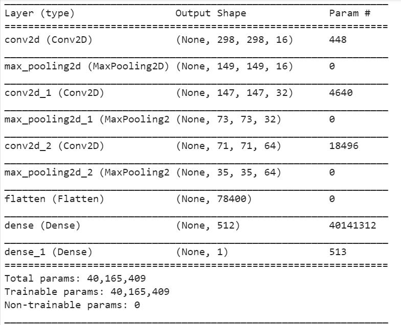
The model architecture for this CNN uses two Conv2D layers and 2 max pooling layers. The first Conv2D layer takes the resized 300x300 pictures and cuts off a pixel border and the new shape becomes 298x298. The MaxPooling2D layer cuts the Conv2D layer in half and feeds it into the next Conv2D to repeat the same process. I used the sigmoid activation in the last layer. The sigmoid activator pick the highest probably and round it to 1 and zeros out all of the probabilities to make choosing the correct label easier. I used loss=’binary_crossentropy’, optimizer=RMSprop(lr=0.001), metrics=[‘accuracy’] as my arguments for my compiler.

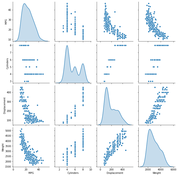
The pairwise plot allows me to easily see if there is a positive or negative correlation between the variables. The diagonal access represents the correlation between the same variables. Since it is comparing against itself it is showing the distribution of the data from the mean.

From the last 5 observations I can’t determine if the model is getting better or not. The MAE reached it’s maximum at epoch 997 and it has it’s minimum MSE at epoch 999, the validation loss started decreasing bit then increasing, and that trend is the same for validation MAE/MSE.

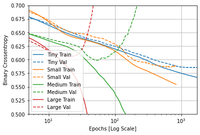
The significant of comparing the 4 models is to see which model is underfit or overfit.
